Like any business, a large non-profit organization needs a strong online presence. Most people do research before donating or getting involved with a particular cause, and they’ll likely make online searches their first stop. Here are a few factors that make a non-profit site successful.
Clarity and Messaging
Visitors come to the site looking for answers to questions they have about the organization and its cause. When choosing a non-profit, people want to know if a given organization is legitimate and honest. The site should have clear messaging about its purpose, mission, history, and how someone can donate or get involved and what impact it would make. Visitors should have a clear idea about the organization’s purpose from the homepage alone. The homepage and its messaging should draw the visitor in and persuade them to explore the rest of the website.
Clear Calls to Action
A non-profit’s website should inspire action. Most nonprofits rely on the involvement of members of the public. Whether it be donating, volunteering, connecting via social media, or signing up for a newsletter, clear and bold calls to action should be clearly visible. As purpose driven organizations, the website should convey strong messaging about its cause and why they are deserving of their support. Friends of the CMHR is a good example of a site that has great calls to action with colourful tabs entitled Be a Friend, Be a Voice, and Be the Change.
Donations Page
The donations page is often the single most important page of a nonprofit’s website. Visitors should be able to easily see where their contributions would go and what impact they would make. The donations page should be accessible, have strong branding, and appear secure and inviting. People will want assurance that their payment information will be secure and that it’s not a scam. If the donations page is on a page off of the main website it is even more critical to clearly display the organization’s corporate identity and have a strong URL.
The donations link should be noticeable and recurring throughout the site. The easier it is to donate, the more likely people will be inclined to do so. A visitor who would be willing to contribute may otherwise be deterred if they are unable to easily find information on how to help. A well-designed donation page will also include different donations options such as a one time donation, a monthly contribution, in memoriam, or as a gift on behalf of a loved one.
Here are five nonprofit organizations that have developed beautiful websites that are compelling, functional, and informative.
1. Acumen
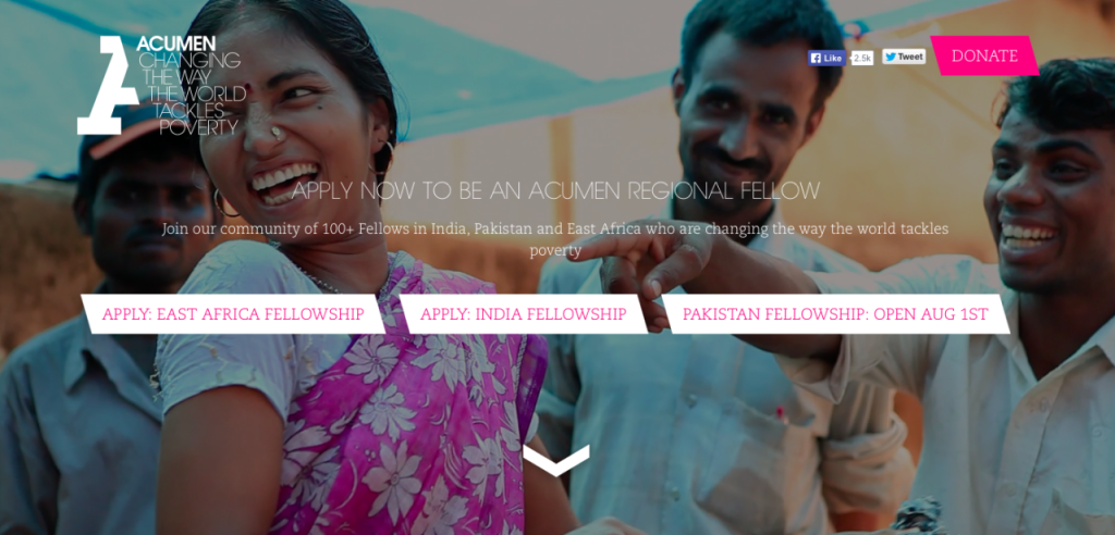
- The Acumen website does a great job of integrating multimedia throughout the site, allowing visitors to consume information in multiple ways including video, photography, text, and info graphics working together to create an engaging experience for visitors.
- The homepage is visually compelling and immediately catches the eye as colourful clips of team members and people who have been helped by Acumen play on a loop. Manoverboard worked with Acumen during its founding to design a corporate identity, initial website, and style guide that was instrumental in establishing them as a leader in global philanthropy. The current site was designed by the digital agency Briteweb.
- There are several videos throughout the site that demonstrate what Acumen does and how their different programs work—a great alternative to having visitors read a slew of text.
- The site uses bold colours, fonts, and images in a clean and modern design.
- The “Donate” button remains in place and active while you continue scrolling through the website to make it easy and accessible for someone to make a contribution at any point during their visit.
- Linked social media icons are displayed visibly and promptly.
2. World Wildlife Fund
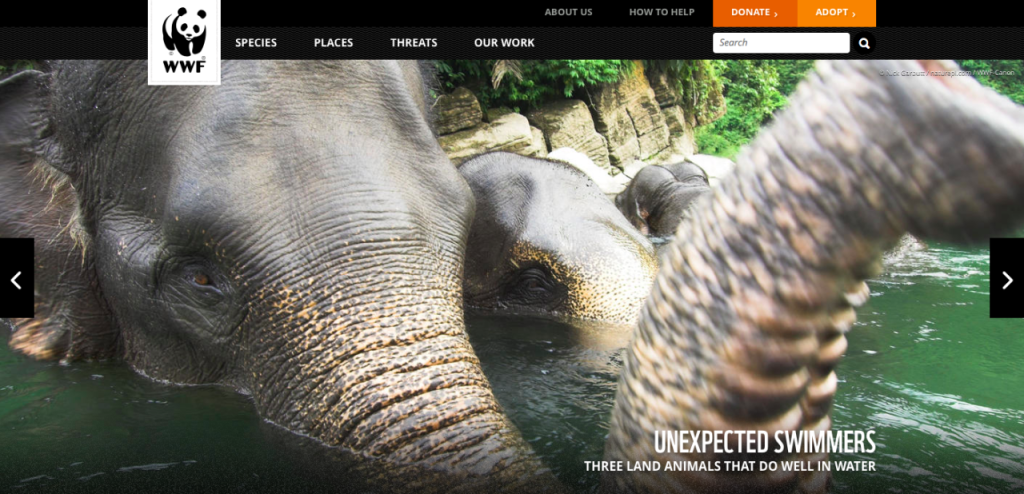
- The World Wildlife Fund knows its audience well. Their website is clearly marketed toward animal lovers and environmentalists by having their main tabs labeled Species, Places, Threats, and Our Work.
- The website features stunning photography of wildlife and landscapes.
- The “WWF in the News” section is frequently updated with news articles and stories featuring their work.
- Along with donations, WWF features adoption options that allows people to “adopt” a wild animal of their choice in exchange for a donation. Who wouldn’t want to adopt a tiger?
- Along with donating and adopting an animal, the WWF website offers a plethora of other ways that people can get involved with their cause like starting a personal fundraising campaign, sharing WWF news on social media, and signing petitions.
- The site features infographics for the WWF’s operating revenue, total expenses, and links to financial reports, which promotes transparency for the organization.
Visit World Wildlife Fund Website
3. Counterspill
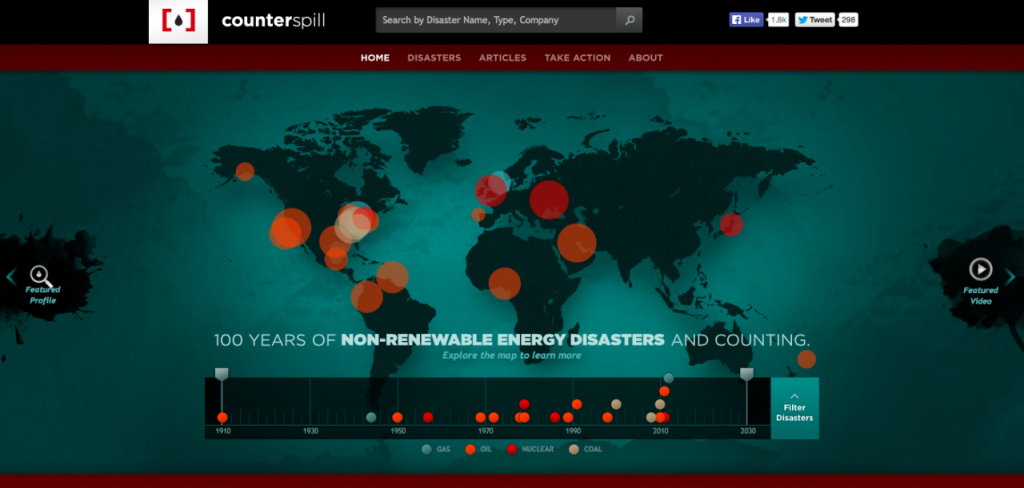
- Counterspill uses powerful imagery to make an immediate impact on site visitors by showing a map of non-renewable energy disasters that have taken place over the last 100 years.
- Visitors can see the number, scale and year of the devastating gas, coal, oil, and nuclear disasters that occurred all over the world.
- Just below the map is a “Spin Central” section that features quotes from head officers of the companies involved in the disasters trying to downplay the extent of the damage and the role their company played. This section works well to support Counterspill’s messaging.
- The site features a Disasters section that offers information about each disaster in the form of infographics, photographs, videos, and related media.
4. Natural Resources Defense Council
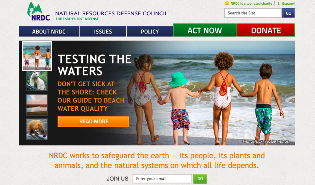
- The NRDC is a great example of a site that is well organized with a comprehensive main navigation featuring About NRDC, Issues, Policy, Donate, and Act Now.
- The website has a clear call to action with the Donate and Act Now tabs featured in large font and bright green and red colours to stand out. The same calls to action are are featured again in large blocks further down the main page.
- Visitors can also subscribe to their newsletter by entering their email address from the home page without having to scroll down.
- The site features tons of content, with links to their own work, videos, news and reports, related blog posts, and important publications.
5. Into the Arctic
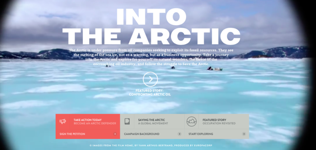
- The homepage is extremely powerful, complete with moving imagery, music and a narrator explaining the Into the Arctic project by Greenpeace.
- As the narrator explains that the arctic is disappearing due to global warming, the images begin to shrink, parallelling the imminent loss of this frozen habitat.
- Before entering the site, the visitor is immediately prompted to sign a petition to declare a global sanctuary in the arctic. The link to the petition is also on the main navigation making it easy for people to get behind their cause.
- Visitors can interact with the site by following the journey of four people representing Greenpeace who traveled to the North Pole in protest of oil companies drilling in the arctic. Visitors can explore the arctic on a map by seeing the date, coordinates, temperature, and reading their logbook of the days’ events complete with pictures.
- Links to information about wildlife, oil companies seeking to drill in the arctic, and geography are also available and include impactful photography.
6. The Future of Car Sharing
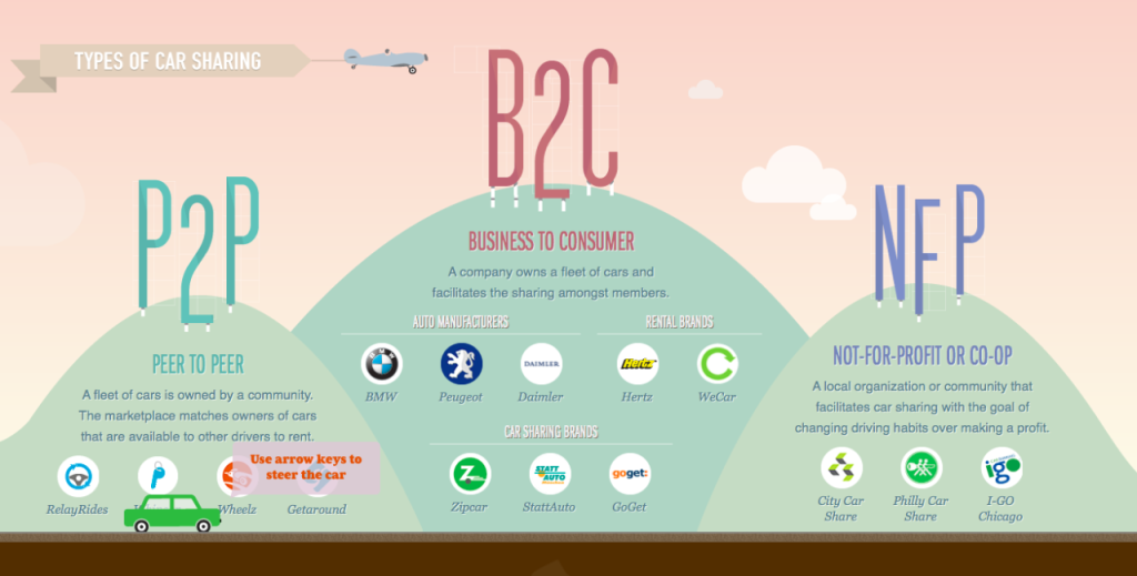
- The Future of Car Sharing is not a non-profit organization, however, the site is so cool that it is still worth checking out.
- The messaging is very clear. Its goal is to simply educate the public about the benefits of opting for a car-sharing program as opposed to owning a vehicle.
- The website is reminiscent of a Super Mario game, where the user scrolls from left to right to move a little green car through the website.
- “Easter eggs” are hidden throughout engaging the user in a hunt to find them all. Did you spot the ufo?
- The site uses colourful imagery and moving infographics to demonstrate the benefits of participating in car sharing programs in a captivating way. By giving the user a unique experience, they are more likely to spend more time on the site, which gives them more opportunity to convey their message.
- The site was name site of the day on AWWWARDS, a site for recognition and prestige for web designers.
Visit Future of Car Sharing Website
While many non-profit organizations have tough budget constraints to work with, investing in a professionally-designed website can make a real difference in attracting new supporters, keeping current supporters engaged, and increasing visibility for the organization and its cause. Connecting to a given cause via a seamless website creates a more confident and powerful experience with the non-profit. The more positive the user experience is for the visitor, the more likely they are to make a donation, get involved with the cause, and share the organization’s message. There is an abundance of worthy causes to get involved with and a beautiful site is a great way to stand out.

