We are starting to see a renaissance in the world of design for the web. Some may call it a trend, but from the perspective of a designer in the profession for many years, much of the current designs are being informed by an approach that has been in place for quite some time now. The approach is one that maximizes the available space in the browser and is usually characterized by the use of large photography or video. The term I will use in identifying this approach to web design is ‘Full Bleed.’
Bleed is a printing term that refers to printing that goes beyond the edge of the sheet before trimming. In other words, the bleed is the area to be trimmed off.

Advertising and the Bleed
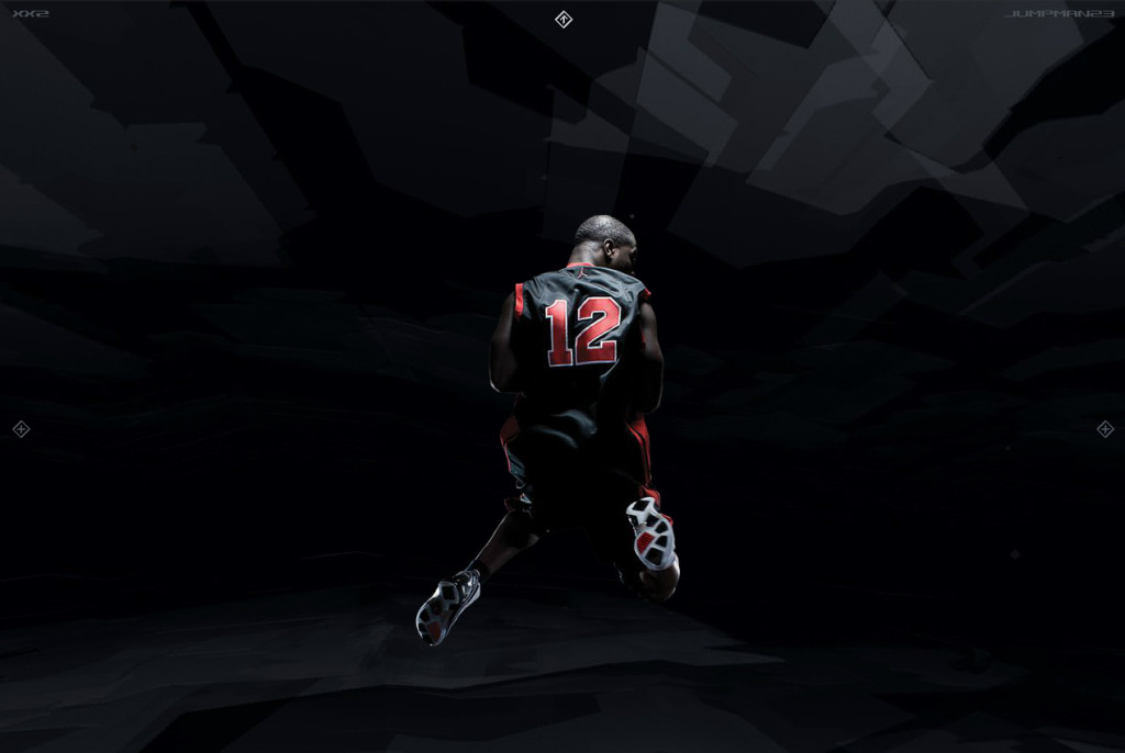
In the quest for the Full Bleed website, advertisers went beyond the edge in the mid 2000’s led by Blast Radius’ work for Nike’s Air Jordan brand and the exceptional web experiences by Big Spaceship for the film industry. With the Full Bleed of colour and images proliferating the web in those days, it was only a matter of time before this would be applied to video.

Pushing the Edge
One of the first Full Bleed websites to go beyond the edge both visually and technically was accomplished by Big Spaceship and their work for the feature film Wolf Creek back in 2005. The use of video as elements in the background of the site pushed the concept of a Full Bleed website to even further heights. With much of the advertising world already embracing this approach to web design in the mid to late 2000’s, it wouldn’t be until later that the design world started to embrace it as a whole.
“New open standards created in the mobile era, such as HTML5, will win on mobile devices (and PCs too). Perhaps Adobe should focus more on creating great HTML5 tools for the future, and less on criticizing Apple for leaving the past behind.”
—Steve Jobs
In April of 2010 the design and advertising world watched as Steve Jobs wrote an open letter entitled Thoughts on Flash. This for the most part was the beginning of a movement away from Adobe Flash as a tool for web design and a movement towards a more standards based approach to delivering both conventional and experience based websites. For the better part of five years, Flash had been a critical component in delivering the Full Bleed website experience. For those of us who had relied so heavily on the technology, it was a fairly dark period. There really was only one choice—and that was to adapt.
Fast Forward to Now
It has been almost four years since Steve Jobs wrote those thoughts and the web landscape has changed significantly. For the most part it has been a shift away from thinking about websites purely as a desktop experience, and looking back it was definitely the course that had to be taken. After experiencing a few years of stagnant creativity on the web, we seem to be getting back to where we were almost 10 years ago. We are experiencing a renaissance.
Design Embraces the Bleed
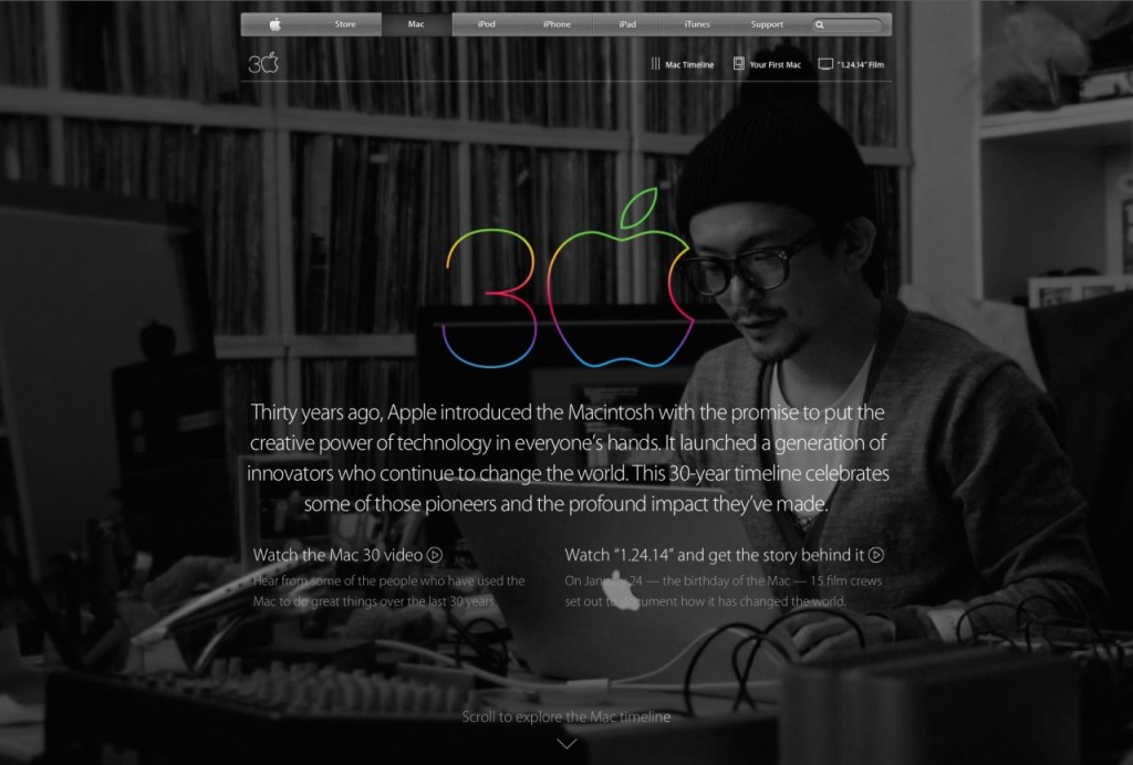
Instead of the Full Bleed site only being a tool of the advertising world and those who designed experiences, it has permeated into all facets of the web design world. We not only are encountering this web design approach for large brands wanting an online experience, but we are seeing it used everywhere from small craft businesses all the way up to Fortune 500’s. Apple has recently embraced the approach and one need only look at the sites that Awwwards showcases to see how pervasive it has become.

There are many reasons why the Full Bleed website has been able to stand the test of time and there could probably be an entire post dedicated strictly to these reasons. This approach to design is definitely seen as memorable and tends to stick with people well after they have put their computers and devices to sleep. If your business is all about getting your message out there and trying to impact people, this is likely the approach you want to take. In fact, it feels like the only approach to take.
The words of a living legend in design may help us understand why the Full Bleed approach has the potential to be so memorable:
“In communication and design, the most important thing is to develop a sense of affection between the object designed, yourself and the public.”
—Milton Glaser

