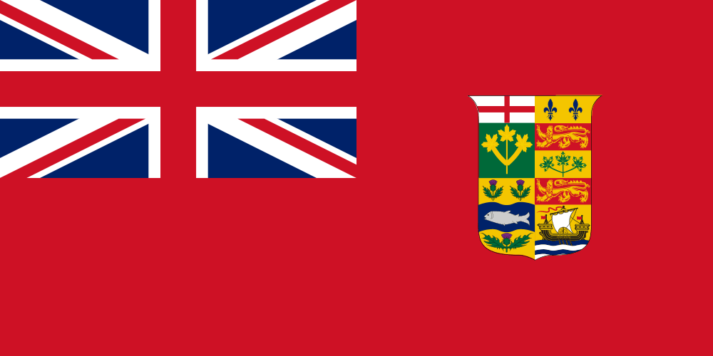
I’m very grateful to be living in this country called Canada, now celebrating its 150th birthday.
In my over twelve years of living here, I have found that the country’s kindness and warmth abounds and that, despite the generally freaking cold geographical climate, its friendliness gets expressed in many different and distinct ways. Mostly it’s in the conversations, populated with a lot of sorries, sureness, and substance. This friendliness is also embedded in the visual culture and history of the country, the shapes and symbols that together express the physical and psychic landscape we experience today.
While these lands have been inhabited by numerous peoples over thousands of years, Canada’s 150th makes it a relative baby among the nations of the world. In honour of Canada’s 150th anniversary, I thought I would share some personal and professional reflections on three important visual Canadian milestones.

The Canadian Flag (Circa 1917)
From what I can tell, it appears that Canada didn’t actually celebrate it’s 50th anniversary. However, there was a flag! The current maple leaf insignia didn’t unfurl as the country’s official flag until 1965. Before then, the country used various mashups of the British flag and coats of arms. That’s what you see above — the Red Ensign Flag that flew around the turn of the century. At that time, Canada was a member of the British commonwealth and it wasn’t until the Statute of Westminster in 1931 that it became independent (or relatively so) from the crown.
It’s hard to feel an emotional or psychic connection to the Red Ensign Flag of Canada. But in looking at it, you get the sense that being part of the British Commonwealth must have filled many Canadians with pride of place that they belonged in the family of nations. The wide swath of red is clearly sampled from the Union Jack and the colour expands across the flag like the many thousands of settlers heading West at the time. The crest in the vast sea of red looks isolated at first — but the individual icons representing the various provinces are woven tightly together and they seem happily united in their relationship with the dominating Union Jack. From the time of Confederation to 1965, some variation of this flag flew over Parliament in Ottawa. And the various components of this flag informed almost all Canadian national iconography to come.

The Canadian Centennial Logo
In 1967, Canada commissioned the type foundry Cooper & Beatty to design the centennial symbol. Designer Stuart Ash was assigned the work and the result was a perfect collection of triangles sitting atop a single arrow that, together, represents all of Canada’s provinces and territories at the time.
Today, the Centennial logo is considered a superb example of modern Canadian design, with its bold colours, tight lines, and rigid, stained glass-like structure. It’s almost as iconic as the identity for the National Film Board of Canada created in 1969 by Georges Beaupré or the Canadian National logo designed by Allan Fleming in 1960.
Since I was born the same year that the Canada 100 symbol was released, I have minimal emotional connection to it. But it strikes me that this logo must have been wildly received. Despite the social turbulence of the time (separatism, recession, hippies), here is a nation on the cusp of something momentous. Toronto’s Caribana festival was launched. In Montreal, Expo 67 was well attended, igniting new national and civic optimism. The Toronto Maple Leafs won the Stanley Cup (and are still waiting to win it again). The Centennial Logo, with its beautiful, mature system of colours held together in a single gem, feels like it’s about to burst open while at the same time, greater forces are keeping it whole, happy, integral.

The Canadian Sesquicentennial Logo
Born out of controversy in 2015, the Canada 150 logo seemingly appears on every cookie, frisbee, and jar of peanut butter (contents not made in Canada). Wherever you go, there it is. The sesquicentennial logo is simply everywhere, even on Costco whisky tumblers.
And while I understand the government’s willingness to license the symbol out so that companies can sell gasoline and organizations can promote their events, the logo itself feels thin. Perhaps because it is thin. In the one-colour version, those twiggy lines emanating out of the stem to form a maple leaf feels unsubstantial. Even the full colour version is wispy and a little weak. Further, those prickly, pointy leaves don’t reflect the warm, inviting ethos of contemporary Canadian culture. A country as vast, strong, and significant as Canada really should possess an equally substantive visual mark to celebrate 150 years of existence.
It doesn’t help that the Harper Government (as it liked to refer to itself when it was in power) used a design competition to find the winning logo mark after it had developed numerous and poorly received designs in-house at Canadian Heritage. Requesting creative work on spec like this is just a bad means of procurement. Just imagine asking someone to design a national flag this way. (Actually, that’s basically what happened.)
Despite it’s visual weaknesses and bastard birth, I admit that maybe, possibly the sesquicentennial logo has grown on me. Slightly. Perhaps. To what do I attribute this? In part, it’s the sheer power of branding; after seeing something often enough, even the most disturbing images can become normalized. But in part, it’s that I want this logo to succeed because Canada only gets one big birthday every 50 years. It works on some fundamental level because, well, it has to.
Happy birthday, Canada. Wishing you 150 more years of strength in diversity, openness and acceptance, and continued design success.

