I never liked the word “brand” or even the very idea of “branding”. Both of these terms reek of 1950s-era Mad Men scenes of drinking and misbehaviour and the smell of cheap marketing. More recently, the concept of branding has come to mean something more like “revamping an organization inside and out, including but not limited to creating new reasons for existing.”
But there is something powerful about the word, still. Branding, and its kinder cousin rebranding, is truly what we do every day for our clients: creating transformative visual and written products and platforms that tell a story and connect them with their customers, donors, and members.
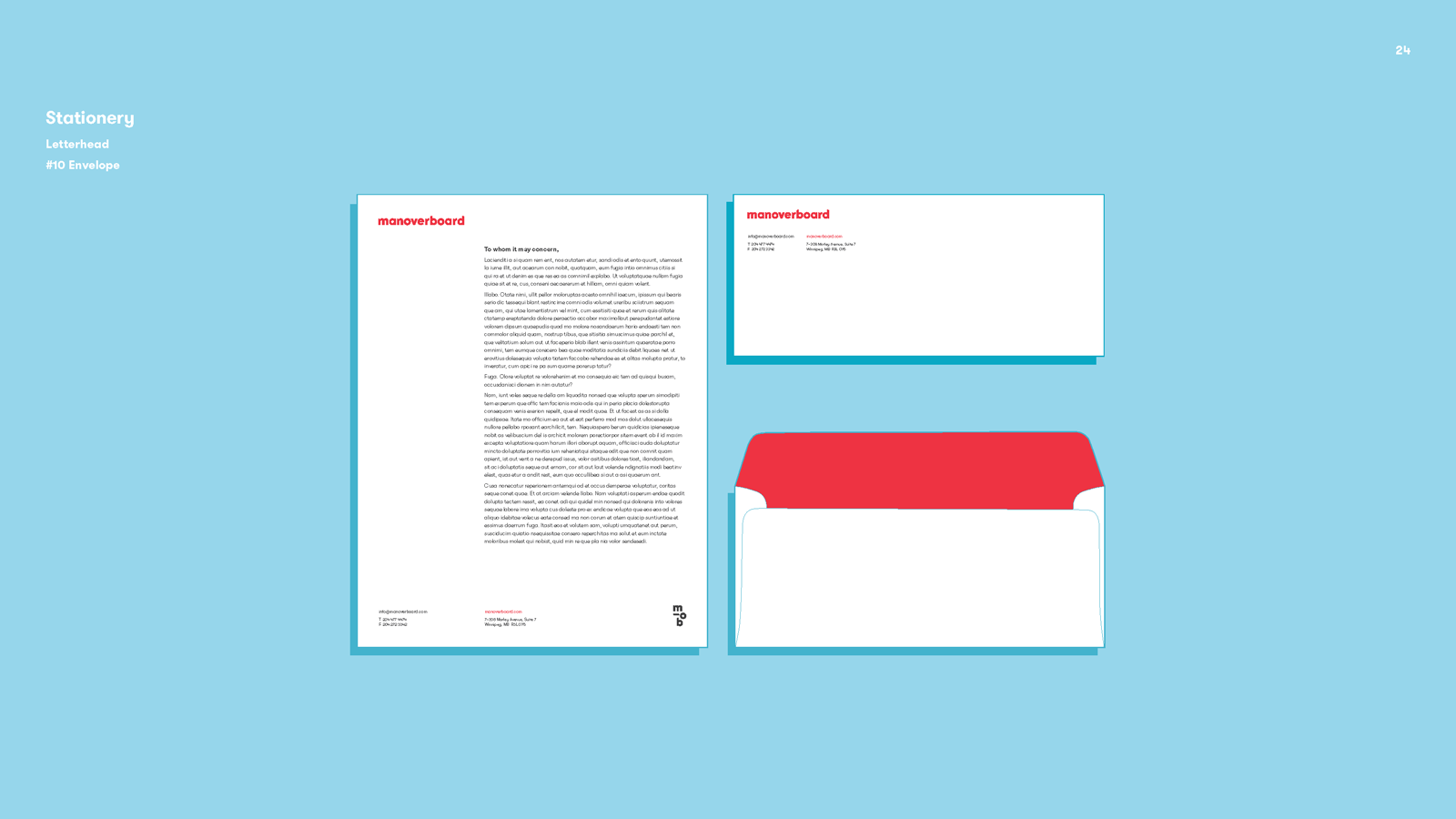
Most often, what we’re talking about here is identity. For nearly fifteen years at Manoverboard, we have created new visual identities and the systems to support them. Much of our identity work includes developing a marketing and content strategy and then producing the requisite communications tools, including organizational logo, brand standards guide, business collateral, and a content-driven website that gets both noticed and found. But what happens when you are a design firm and your brand has become tired?
Why Rebrand When You Can Redesign?
After six years of living with our tried and true and black and blue visual identity, we set out on a path to invent something new. We rebranded. And we redesigned our business.
Why? Three main reasons:
- Manoverboard is evolving like all businesses — and while the work in our portfolio has grown stronger every year, our brand had become dusty. We required an updated visual identity that would have the same substance and vitality of the work being provided to clients.
- Rebranding meant an opportunity to examine exactly what our clients experience in their engagements with us. It was important for us to understand the fundamentals again, and to see where pain points occur. It would also give us a chance to further refine our own processes for the next client and the one after that.
- The rebrand is an opportunity to rethink our values and value proposition. While both are important to every business, as a purpose-driven company, these are even more intimately connected. (And in the ideal world, our clients love us for both.) Rebranding — and all good design — means identifying values and differentiators and finding ways to depict them through the application of metaphor, colour, typography, and iconography. We wanted that.
Land Ho!

How did we get from there to here? We hired a small, external team of incredibly talented and young designers to help us. It was a risky move but it was also the right one. We knew that we were too close to the business and we held too many biases about what was possible to do this hard work ourselves. Had we tackled the identity in-house, I’m pretty confident we would have circled back to exactly where we landed six years ago. Furthermore, I am a big believer in asking for help when you need it. That’s what clients do when they come to us. With the right consultancy, minds and models change quickly and more authentically. And feedback loops are stronger and outcomes are more significant.
The design team met with us numerous times, asked us hard questions about the business over a number of beers, and proceeded to deliver new identity concepts for us to review. After many weeks and much concerted back and forth, we landed on the visual identity that you’re seeing implemented here: a Manoverboard that is brighter, bolder, and more clear than anything we would have come up with on our own — and yet is our own.
All three reasons for rebranding were resolved. First, the new visual identity gave us a new lease on life. With it in place, Manoverboard could design and build a new website that would truly align with the work in our portfolio. Second, we had a chance to eat our own dog food. Sitting in the shoes of our clients for a few months was a humbling experience. We would sometimes look around the table, unable to answer questions, and the sound of blinking was deafening. At the same time we had full faith in our fearless design team who we knew would deliver. Finally, we learned about our own strengths as a team and as a business, and had a chance to examine both our values and our value proposition — again a very humbling experience.
Now with More Red
The result is a visual identity with which we could run. Our new logo uses hand-lettered type with a daring sensibility and a playful sensitivity to pattern and shape. The type itself is bold and physical in nature which reflects our belief in creating real impact in the world. And yet the lowercasing of the letters (from a previously ALLCAPS design) hopefully demonstrates our humor and self-effacing attitude in the work we do.
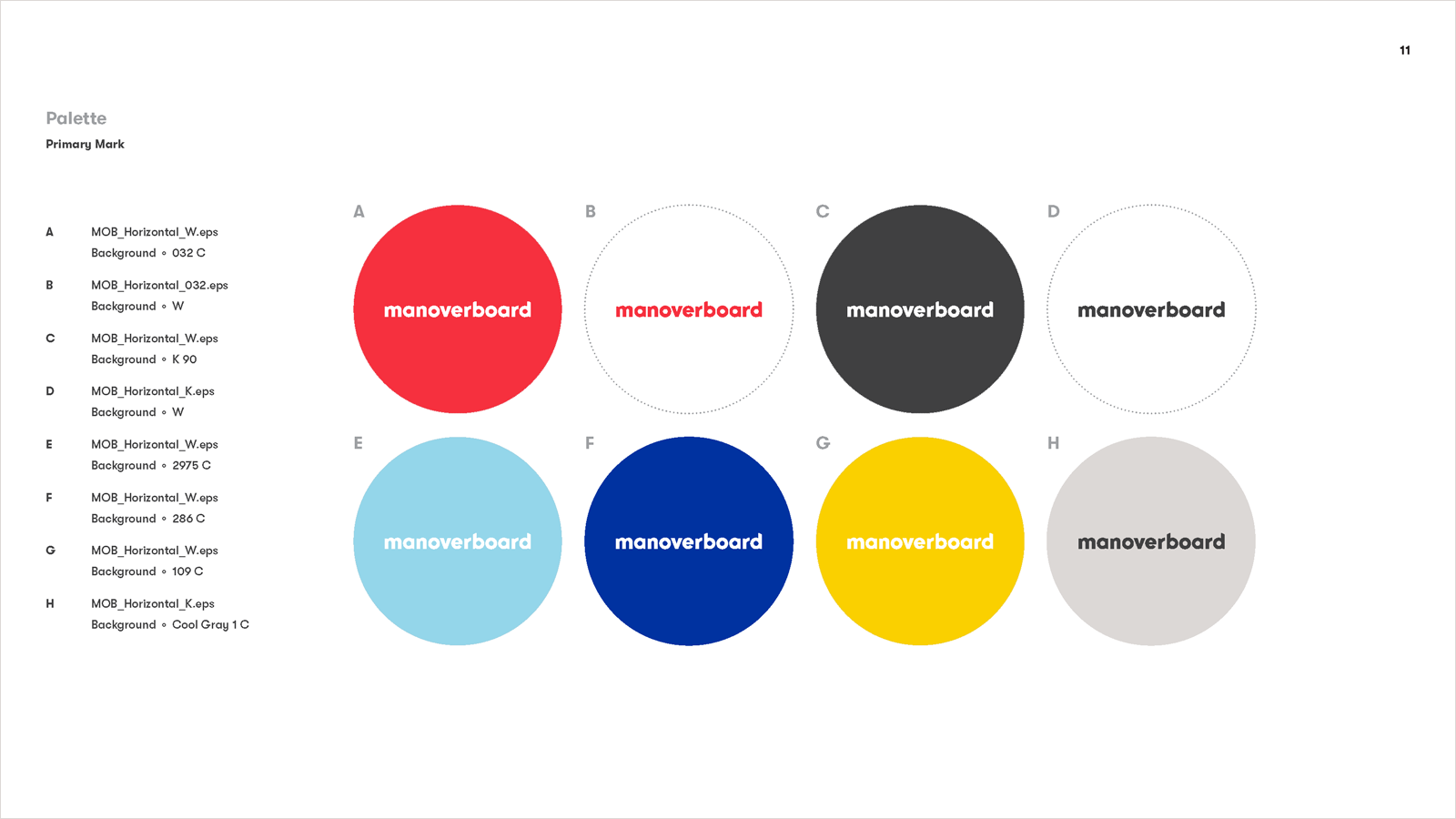
The new color palette, anchored by a cherry red and a cheery blue, shows our quirkier side and, tangentially, connects to both our Canadian and American tastes for tempered optimism, modesty, and delight. What more could we ask for? The new visual identity, substantial and whimsical, is the foundation for this website and is the inspiration for our new tagline: Designing Change. We hope that it will act as a touchstone for all of the work that comes into our studio and emerges from it.
Lessons Learned in Rebranding a Design Studio

As mentioned in the previous post, our new branding spurred us to further boil down our mission and retell our story. It provided new material for us to design and rewrite our message. It also gave us license to be honest and open with ourselves about our strengths and, more importantly, our weaknesses. The result thus far is a new website that better showcases our work, highlights our clients, and demonstrates the impact of their work. And while I’m very happy with the results so far, we have a lot more to do to better help our clients and partners.
“Simple can be harder than complex: You have to work hard to get your thinking clean to make it simple. But it’s worth it in the end because once you get there, you can move mountains.”
-Steve Jobs (of course)
One final lesson learned (actually relearned): simplicity is always tough. When implemented correctly, you gain an opportunity to cut through the visual and verbal chatter of the mind and the marketplace. You also have an opportunity to be direct and say what needs to be said. It is what we aspire to in all of our work here: streamlining, boiling down, reducing and reinforcing — all in the name of helping our clients connect.

