When you invest in creating a brand identity for your organization, it’s because you want the world (or at least your corner of it) to recognize your organization at a glance. So, ensuring consistency in how your organization represents itself to your stakeholders is critical to maximizing its purpose and promise. A brand standards guide provides a concrete representation of that purpose and promise.
Good standards achieve three objectives. First, they consolidate in one document the constraints and choices you have when producing new materials — business cards, brochures, email newsletters, mini sites and monster sites — for your organization. Second, guidelines help leadership, and communications teams, literally get on the same page when it comes to your brand, providing an opportunity for consensus building. Finally, standards create a kind of visual shorthand for producing effective and helpful communications. You don’t have to (and really shouldn’t) reinvent how to present yourself every time you put your brand out there. One added bonus? The process of creating a brand standards guide can be a team-building exercise itself, in which internal goals are extended and expressed.

At Manoverboard, we include a brand standards guide for every branding and identity package that we provide. Some brand standards are more extensive than others depending on the organization’s needs and design assets, but they generally include these core components:
Brand purpose or story
The brand purpose outlines your organization’s reason for being and its position in the market or your community. It can include your vision and mission, a positioning statement and even the tone and personality traits you use to describe your brand.
Use of visual identity or logo
This part of the brand standards guide outlines the dimensions and proportions of your visual identity. It often provides examples of common ways your identity could be applied incorrectly for reference. This standard ensures that those using your brand identity on your behalf understand how to display it to your best advantage. You would never want your logo to be partially reproduced, compressed or applied in a manner that makes it difficult to see or recognize.

Typeface
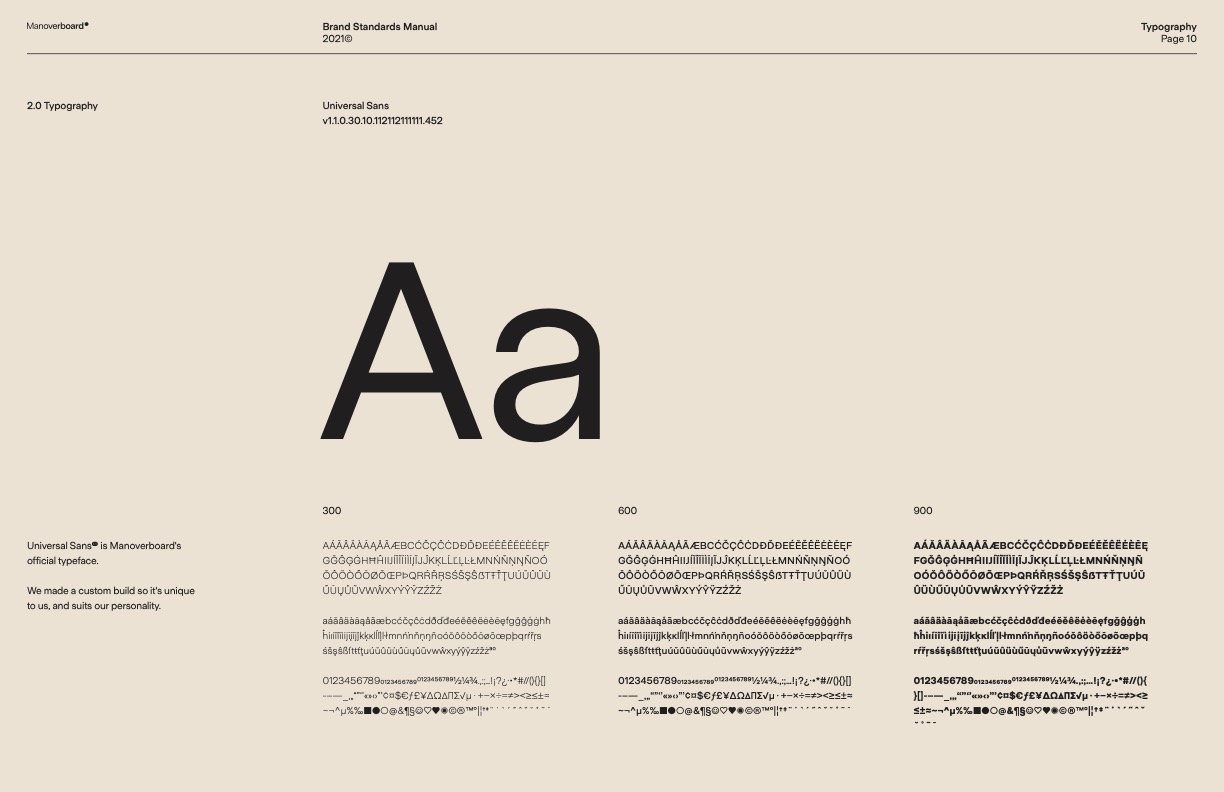
Your brand might have two or three complementary typefaces (a family of related fonts) for specific applications. For example, there might be a distinct typeface for your wordmark or tagline, body text on your website or in print, and for headers. The typeface is a brand asset that often gets distorted over time as staff change and new platforms arise. It’s not uncommon when we do organizational brand audits to find a broad mix of typefaces at play — some of which might work well and others that don’t.
We itemize names, use cases and sources for typefaces in the brand standards guides we create so that this critical component of your organization’s look — how it presents in writing—maintains its integrity over time.
Colour palette
Every visual identity we create has a set of colours to create a unified image. Your logo will have a specific colour formula, as will your website and print materials. Your brand standards tell you how to apply each unique colour and all colours in unison across various mediums (websites, social media and print) and for different applications (campaigns, cover images, business cards).

Photography and graphic elements
Some brand standards will delve into recommended photographic styles or themes, graphic or illustration styles, iconography, and patterns to fit your brand. Other guidelines might include direction around layout and design grids. These photos or graphic elements should complement the colours, typefaces, and logo; they often contribute significantly to the presentation of your overall brand.
Accessibility
Awareness is growing about the importance of ensuring that design provides equal access to those with disabilities. Making sure your brand is widely accessible is important. We can offer tips and guidelines around contrast levels in colour, typographic recommendations, and other features to ensure your content is more accessible to various audiences.
Style guide: a companion to brand standards
The organizational style guide is sometimes confused with brand standards guidelines, but the two are different. A style guide speaks specifically to the language, tone, and writing style acceptable when communicating with your organization’s audiences. It can include direction around capitalization, abbreviations, and acronyms specific to your industry.

Conclusion
It can be easy for busy organizations to lose sight of how their brand is communicated to various audiences across various mediums. A brand standards guide gets everyone on the same page — internal teams, external supports, partners and stakeholders — by providing clear direction on implementing each of its elements.
At Manoverboard, we’ve been creating brand identities for progressive organizations for more than twenty years. If it’s time to align or refresh your visual identity, our crew is at your service.

