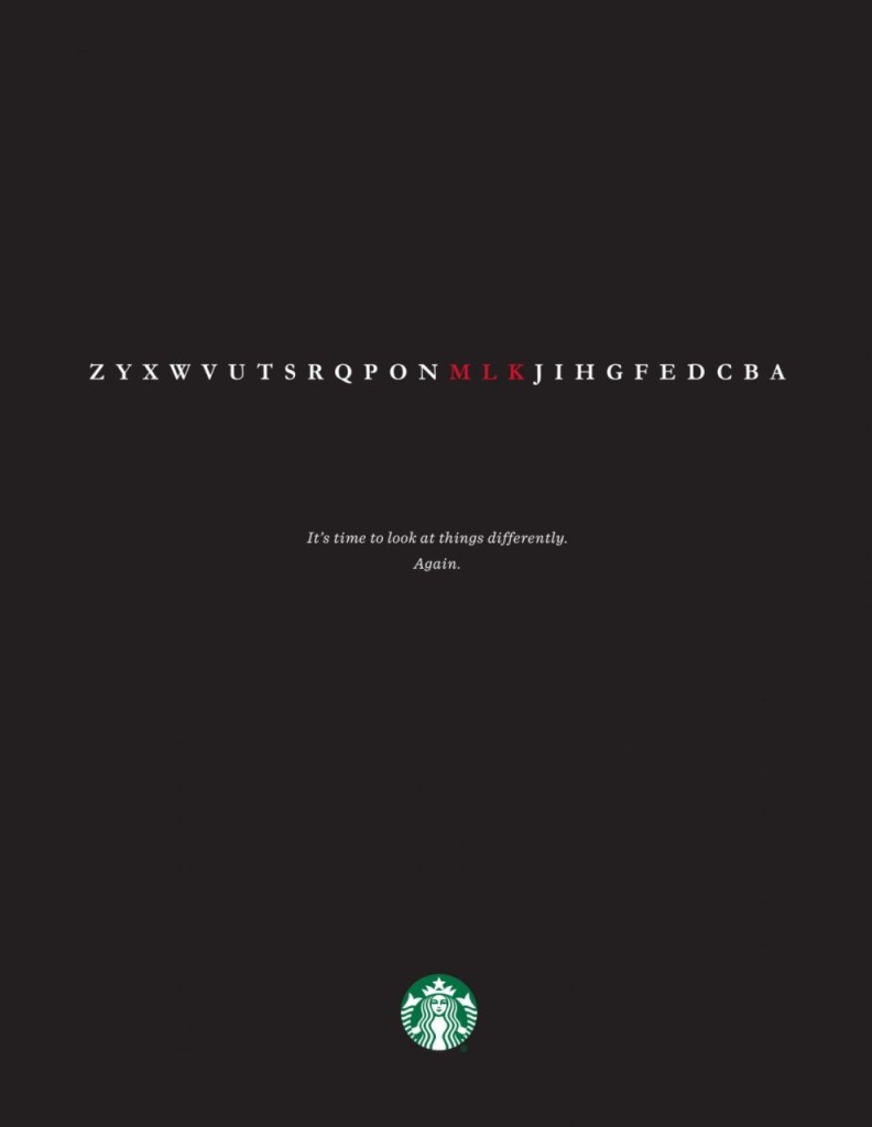
I’m so absolutely taken away by the full-page advert that Starbucks took out yesterday in The New York Times, The Washington Post, and other newspapers. In honour of Dr. Martin Luther King, the ad turns literally turns heads with the most simple of visual messages: the alphabet is reversed and the letters “m”, “l”, and “k”, are printed in red.
The fine print is also writ large in the context of the sheer amount of space that that ad takes up:
It’s time to look at things differently.
Again.
It’s day 2 of the Your Turn Challenge and the question posed is this: Tell us about something that’s important to you.
As a designer, I regularly see (and moreover, feel) the many ways that graphic and communications design has been denigrated, demoted, and defrocked. Designers are asked to steal, to do speculative work, to manage technologies that they don’t understand, and to create commodities that are then used against other designers.
But the capacity for graphic design to change minds and inform opinion makers is limitless. Design, or good design, is the construction of connection, which is so well demonstrated by Starbucks.
Graphic design inherits the very best of the visual and graphic arts. It draws connections between what we assumed we understood and what we think we understand. The new ad from Starbucks connects a fairly simple concept (i.e. the alphabet spelled backward) with a surprise (the witnessing of “MLK”) and then spurs a message of hope. It uses the barest components of design (type, color, iconography, and structure) to inspire, to laugh, and to provoke.
Whether Starbucks will maintain a position of advancing human rights (or adhering to their goals of global responsibility and sustainability) after January 19, 2015, is the question I ask next. Will the company, which makes use of design so well, also live up to its own message? Will it pay workers living wages, adopt and standardize transparent fair trade practices, help fund social enterprise, and adapt clean energy policies?
If Starbucks would truly like to look at things differently, their next full-page ad could say simply this: Today, we are a B Corporation.

