
YWG /
Mikva Challenge is a breath of fresh air in the room of civic engagement in the United States. Founded by Abner Mikva in Chicago more than two decades ago, the organization asks young people what they want for the future, providing resources and frameworks for sharing their views.
The Mikva Challenge has reached thousands of young people through schools and educators with its innovative platform. It has not only transformed young people's interaction with a living democracy; it has also transformed adult perspectives about youth agency and capacity.
When Mikva engaged Manoverboard, it was on a growth trajectory, with partnerships throughout the country and new satellite offices in Los Angeles and Washington, D.C. It wanted to update Mikva's brand to better connect with its core audiences.

During our brand discovery and visual research, we came across the typeface Cooper Black, which appeared in various Mikva campaign materials over the years.
Designed in 1922 by typographer Oswald Bruce Cooper, the typeface’s black weight was innovative for its time, setting a new trend in advertising typography. To us, it embodied the grassroots, boots-on-the-ground attitude required for meaningful social change.
Fittingly, Cooper designed the typeface while working in Chicago, the home of Mikva Challenge. We settled upon Cooper Black Italic for the organization’s full name, Mikva Challenge.


Our team was unanimous about the decision to use a wordmark for Mikva's visual identity. The choice fits the organization's action-oriented character and focus on conversation and immediacy.
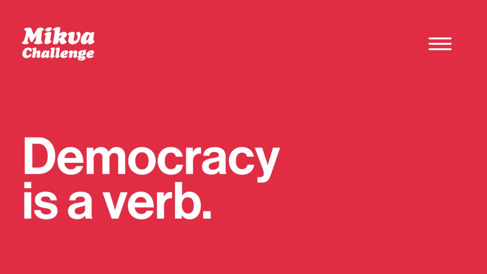
Set in Cooper Black italic, Mikva's name stands apart, lending itself well to campaign buttons, t-shirts, and other brand expressions. The result is a wordmark with an authentic, stylish retro vibe. For the bulk of its written communications, we choose the Neue Haas Grotesk typeface, using Cooper Black for extra punch where needed. We also developed a bold colour palette to amplify the organization's impactful messaging.
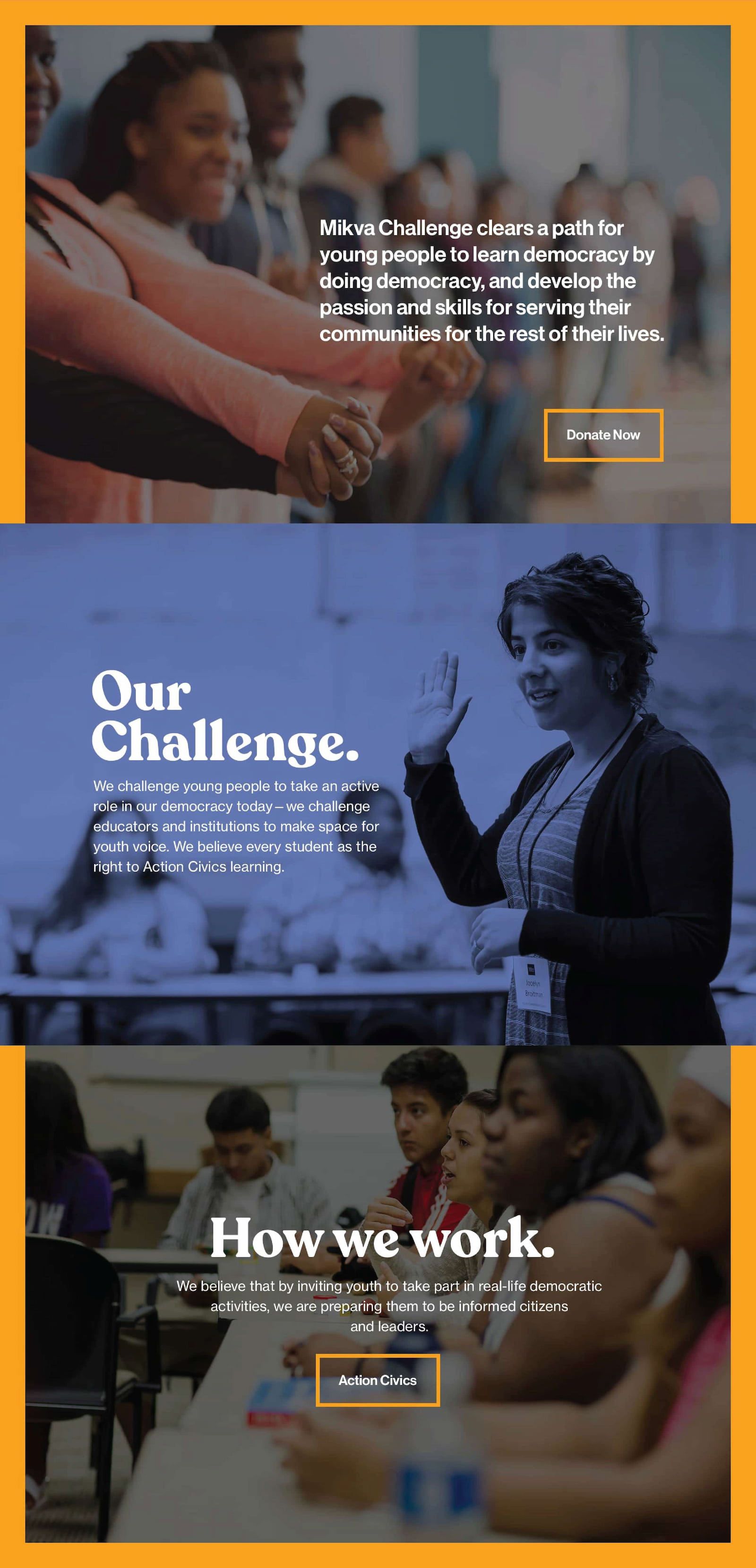
We developed Mikva's new website featuring its invigorated brand and using stories and proof cases to convey the weight of civics issues and solutions and to advance Mikva's educational framework. Working alongside the organization, we reduced and reorganized its online content to build a more organized and efficient website. Greeting visitors to the homepage is a single, powerful statement: Democracy is a verb. Beside it, a cursor blinks with a sense of immediacy, signalling the importance of the next moment and of taking action now.


Andrew and his team are an absolute pleasure to work with. Our website went live on time, on budget, and is not only beautiful — but easy to navigate. Our team felt Manoverboard really understood our organization and they were able to help us think through new and impactful ways to tell our story online. We look forward to continuing our work with Manoverboard.
— Mary Carlson, Chief Development Officer